
About
For my senior capstone class, my team created a marketing campaign for our client: p.o.p. candy co. p.o.p. candy co is a mom-and-pop owned candy company based in California. Our goal was to create and pitch a campaign to establish brand growth and rejuvenate brand identity.
I was responsible for the art direction and design of our campaign. All work shown was created and designed by me.
I used Adobe Illustrator, Dimension and Photoshop.
Process
Research
Our team was able to understand the market climate of the dessert and confectionary industry and understand the company’s strengths and weaknesses. Looking at the following competitors and benchmarks, we were able to set goals for p.o.p. based on the information we gathered and come up with a key research insight.
Strategy & Creative Brief
What we knew:
p.o.p. candy is a buttery, toasty, crunchy deliciousness called butter crunch. It is made in small batches, with clean ingredients, and love.
The problem:
While p.o.p. is a company that is full of warmth and personality, it needs to pivot post-covid to a strong online platform that reflects who they are, while maintaining the strong community based engagement that gives their brand umph.
Our goals:
Expand audience and brand awareness, tell their story, and grow online sales and repeat customers.
Creative Direction
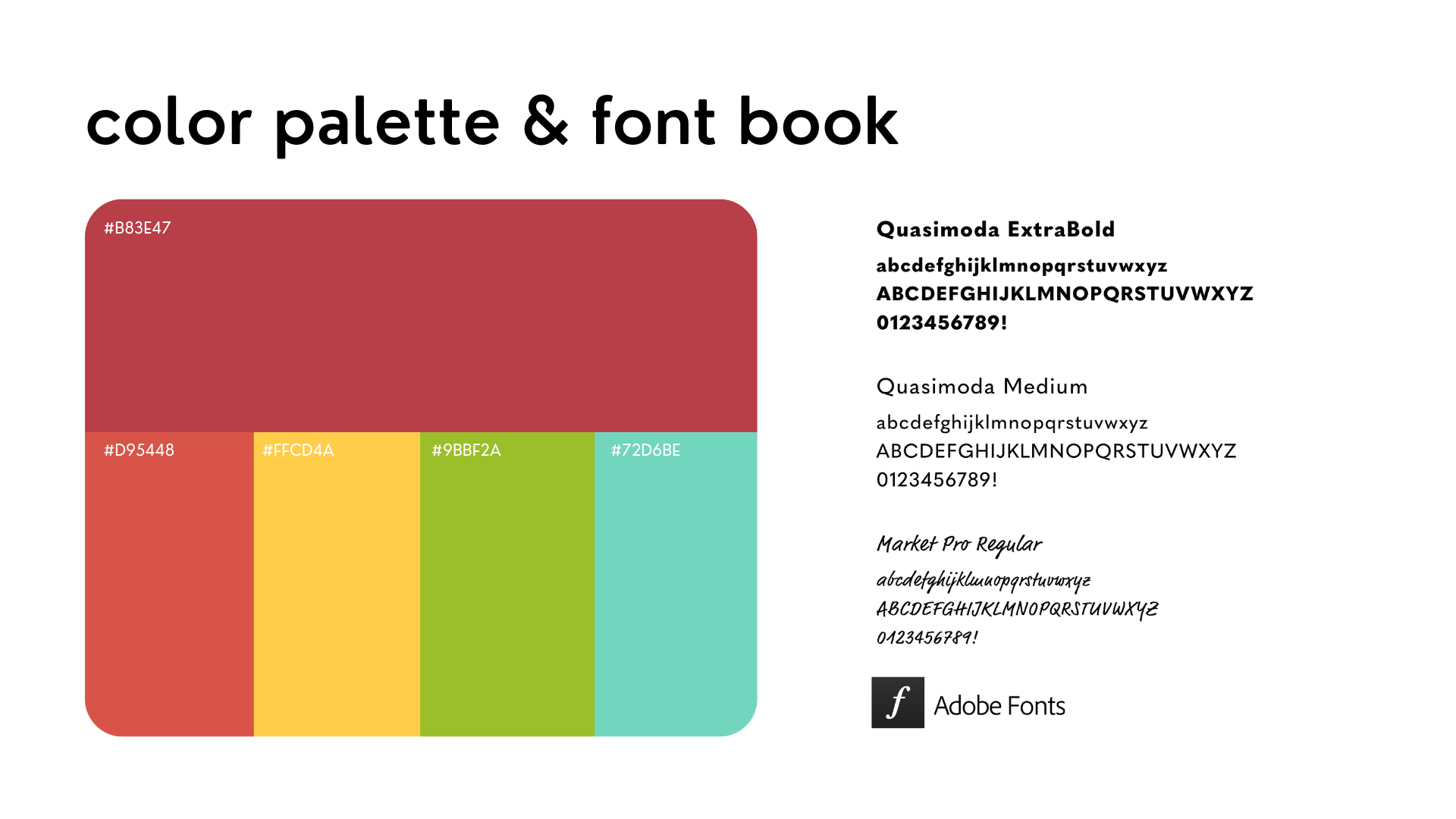
I created a mood board that represented the community and liveliness of p.o.p., and included elements of pops of color and playful shapes that we wanted to incorporate into the campaign.
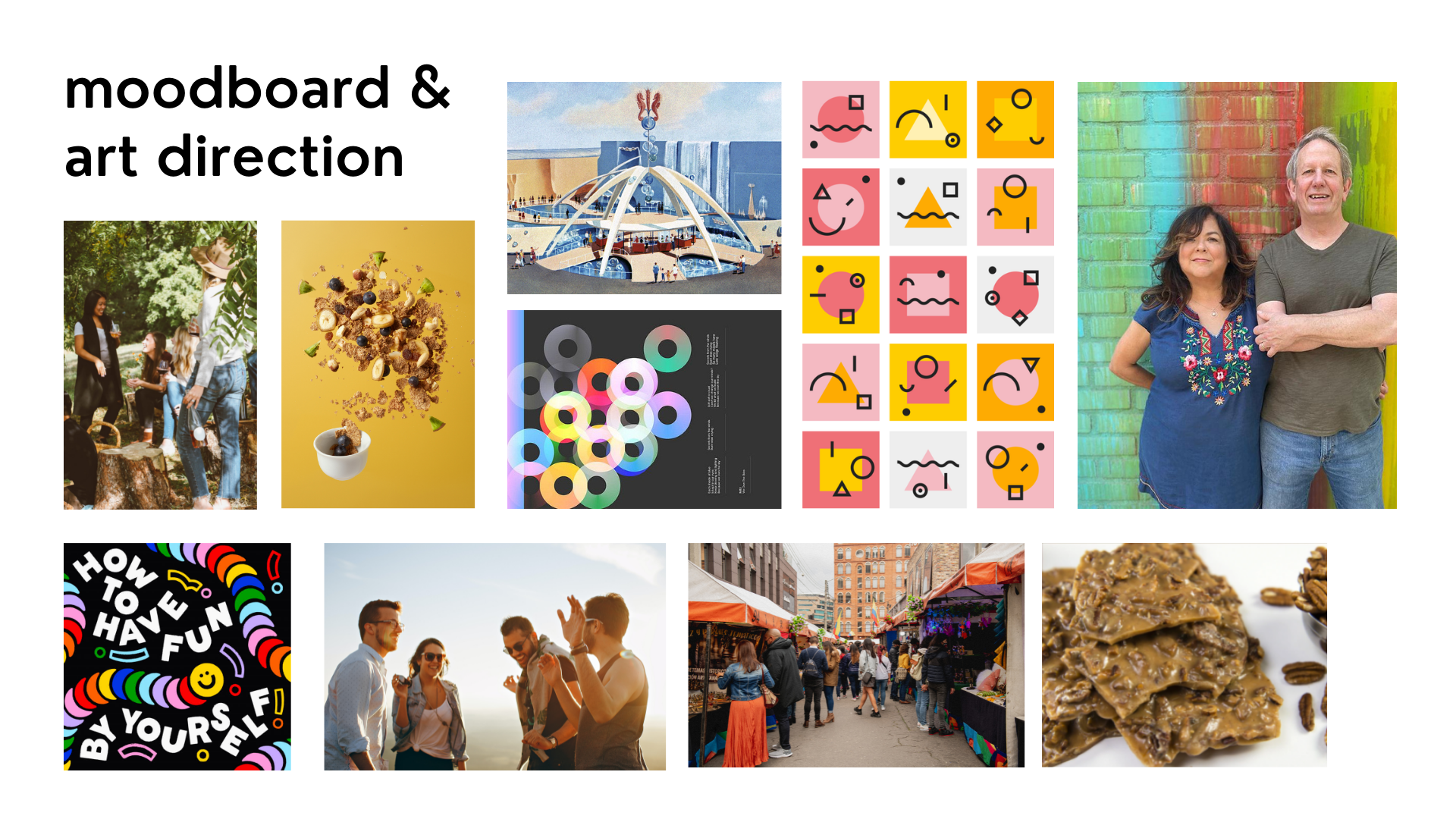
We wanted p.o.p.’s butter crunch to be known as a snack that is suitable for any occasion, so we wanted the color scheme to be vibrant and versatile.
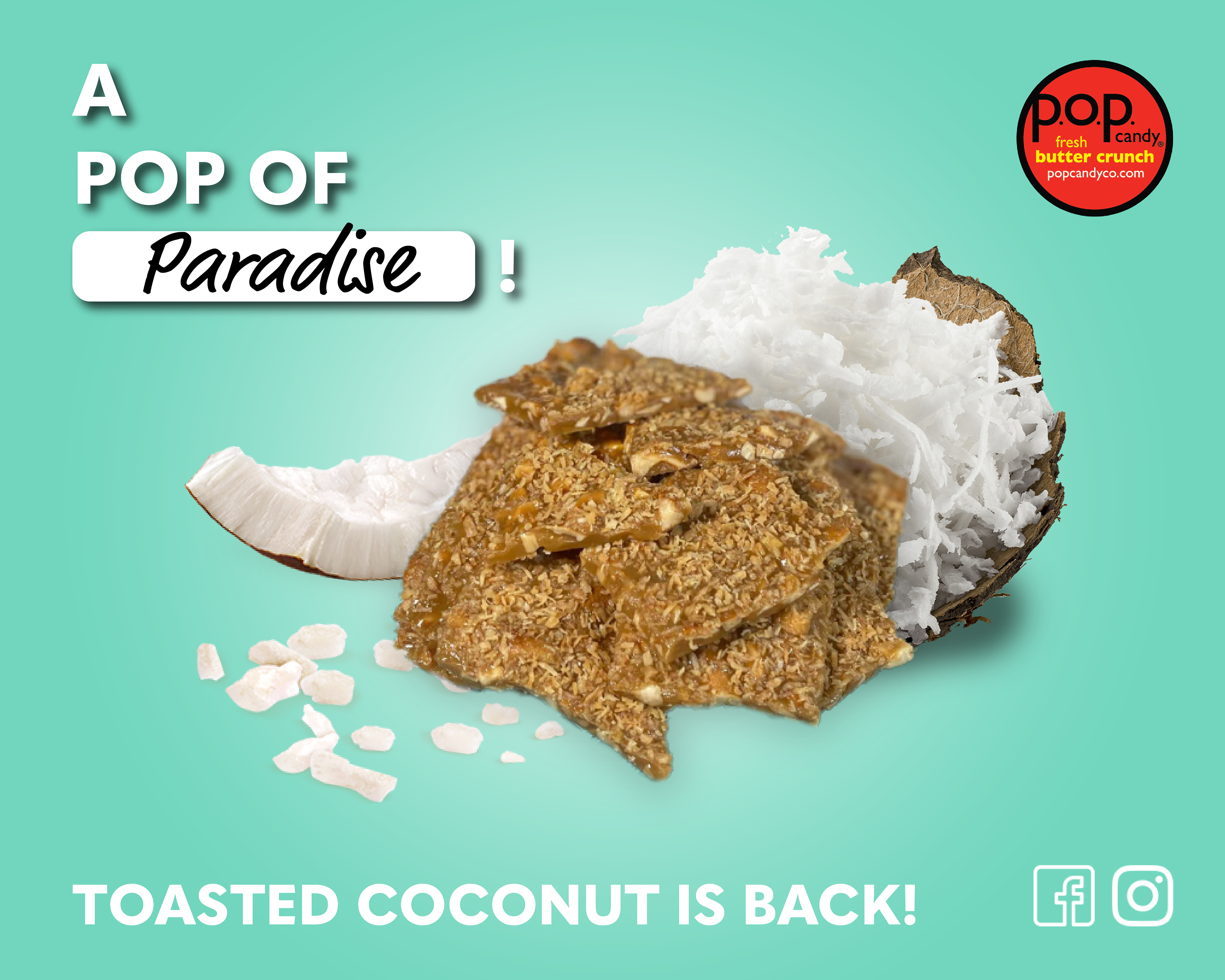
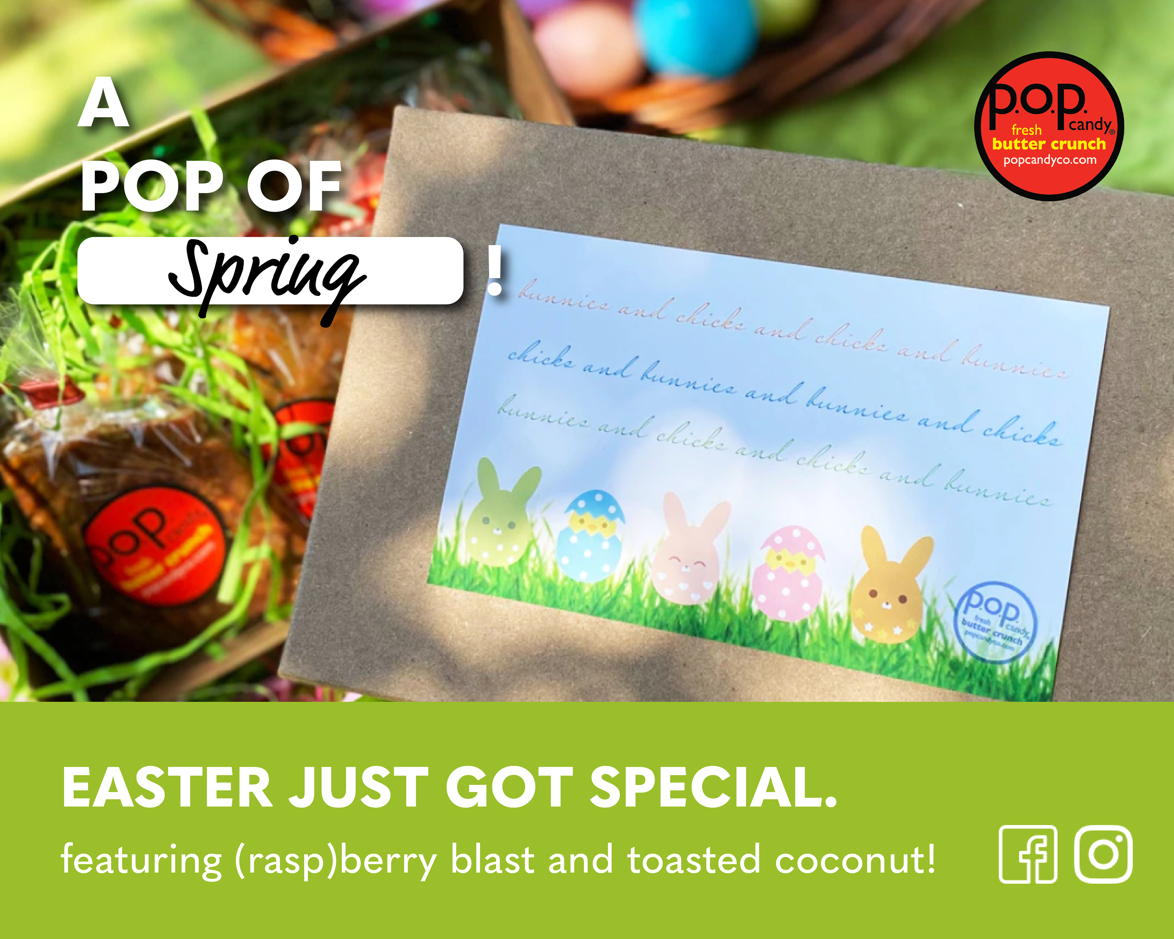
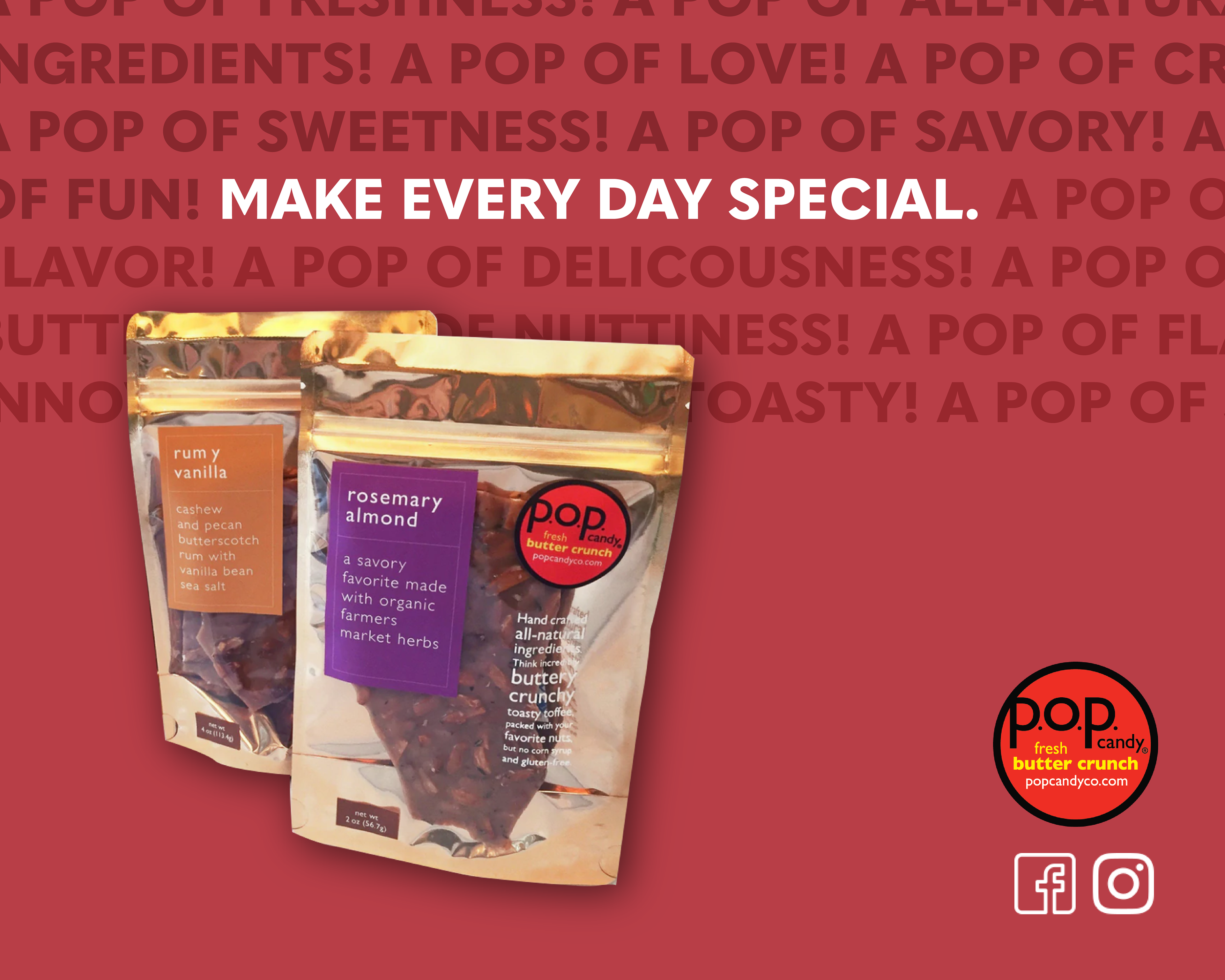
Key Art
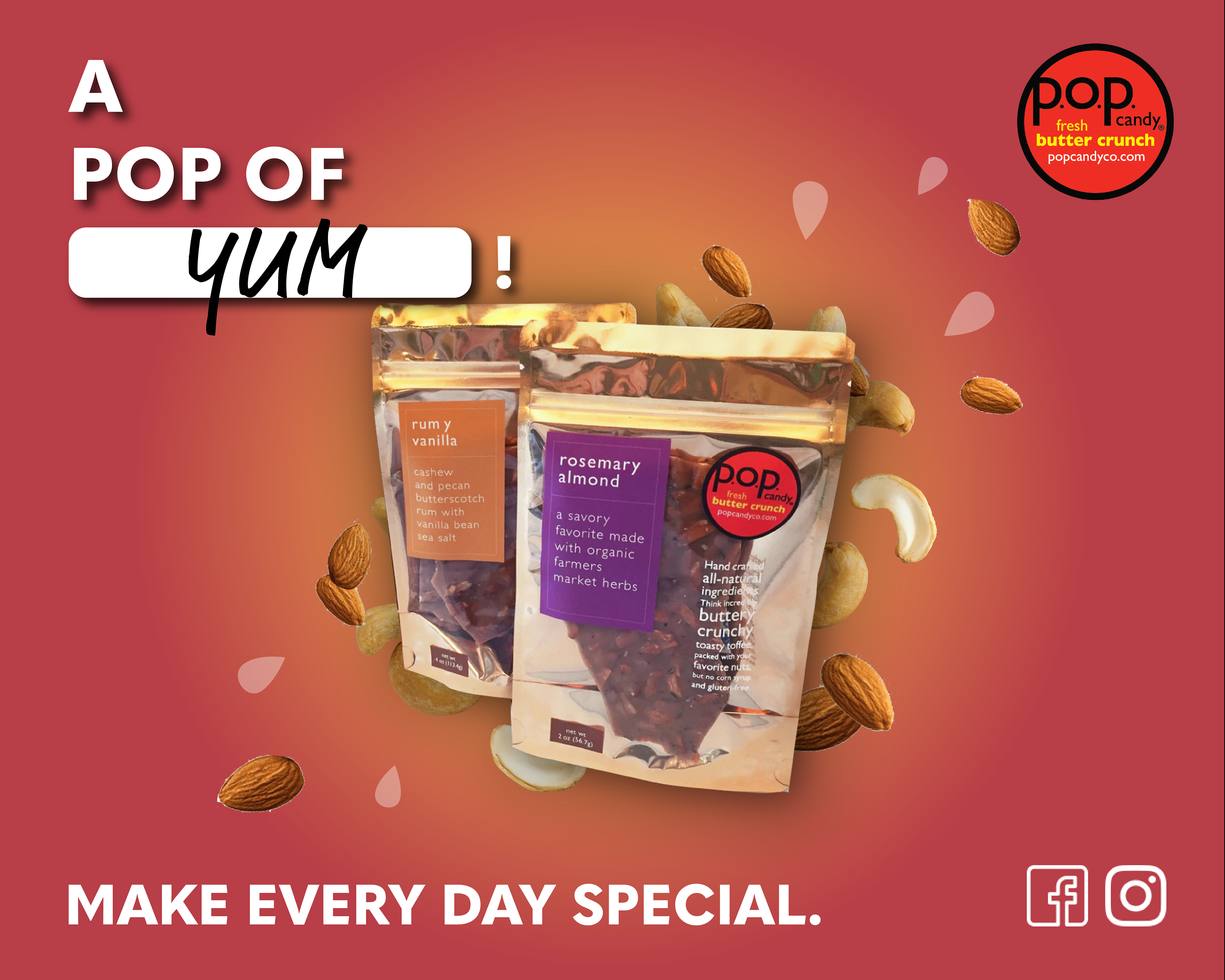
Showcasing our big creative idea, here is the key art I created to base the entirety our campaign off of.
The headline: "A POP OF ___!" can be filled in with any word and can be interchanged depending on the flavor of butter crunch, occasion, or desired mood.
The tagline: "Make every day special" is based off of our positioning statement: a "pop" of flavor that turns any day into a special day.
Implementing our creative idea, I created two example ads and a poster that could be used for promotions.
Campaign Tactics
Our team came up with campaign tactics in three categories: social media, out of home, and visual design.
For social media tactics, we explored ways to improve presence through Instagram, TikTok, Twitter, newsletters, and email blasts.
Out of home tactics included subscription box partnerships, in-box-promotions, pop-up stands, hotel partnerships and co-workspace opportunities.
I was responsible for all of the following visual activations.
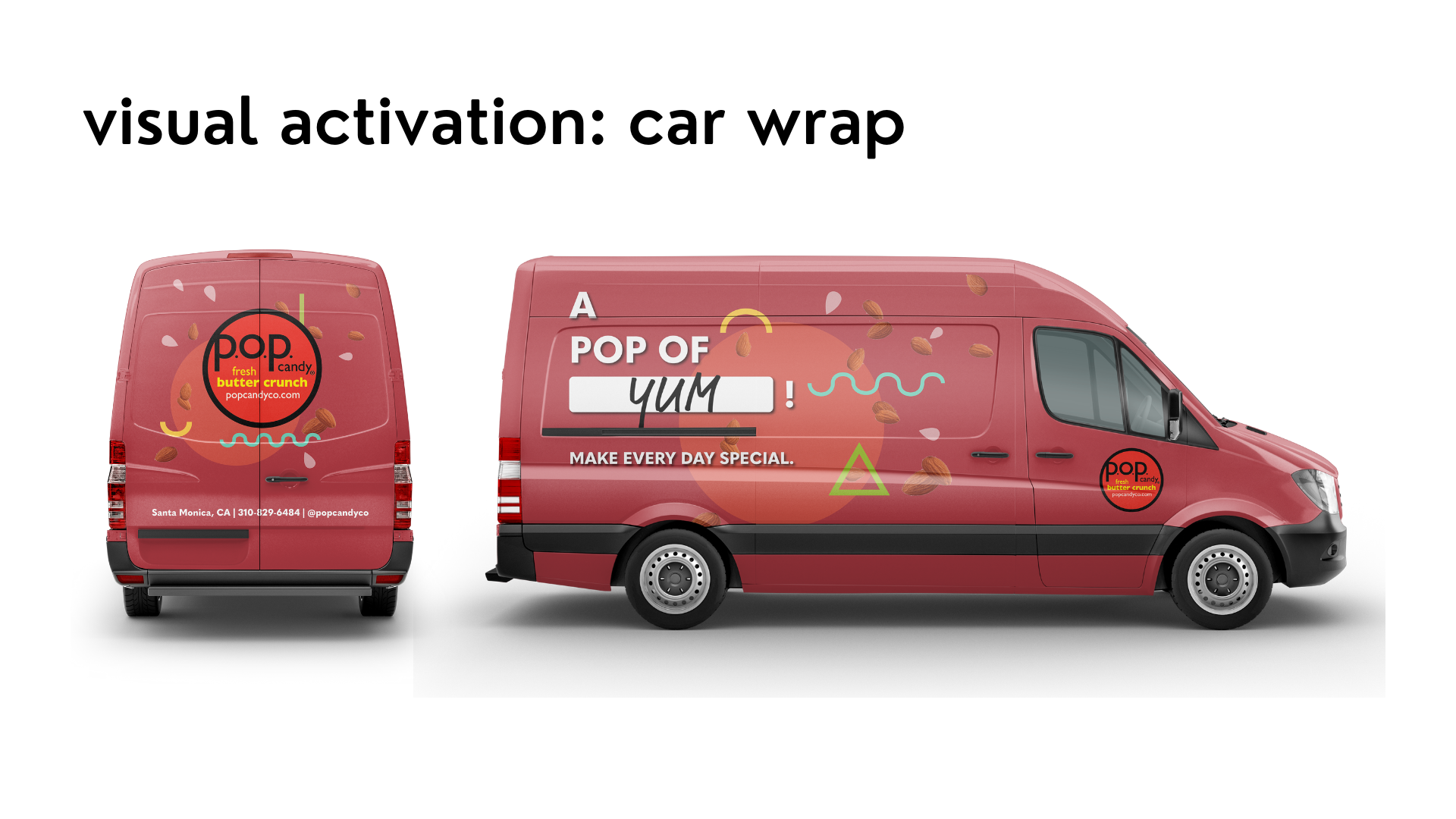
p.o.p. travels to and promotes at many in-person events, so I designed a vehicle wrap that could attract customers and make pop recognizable on and off the road.
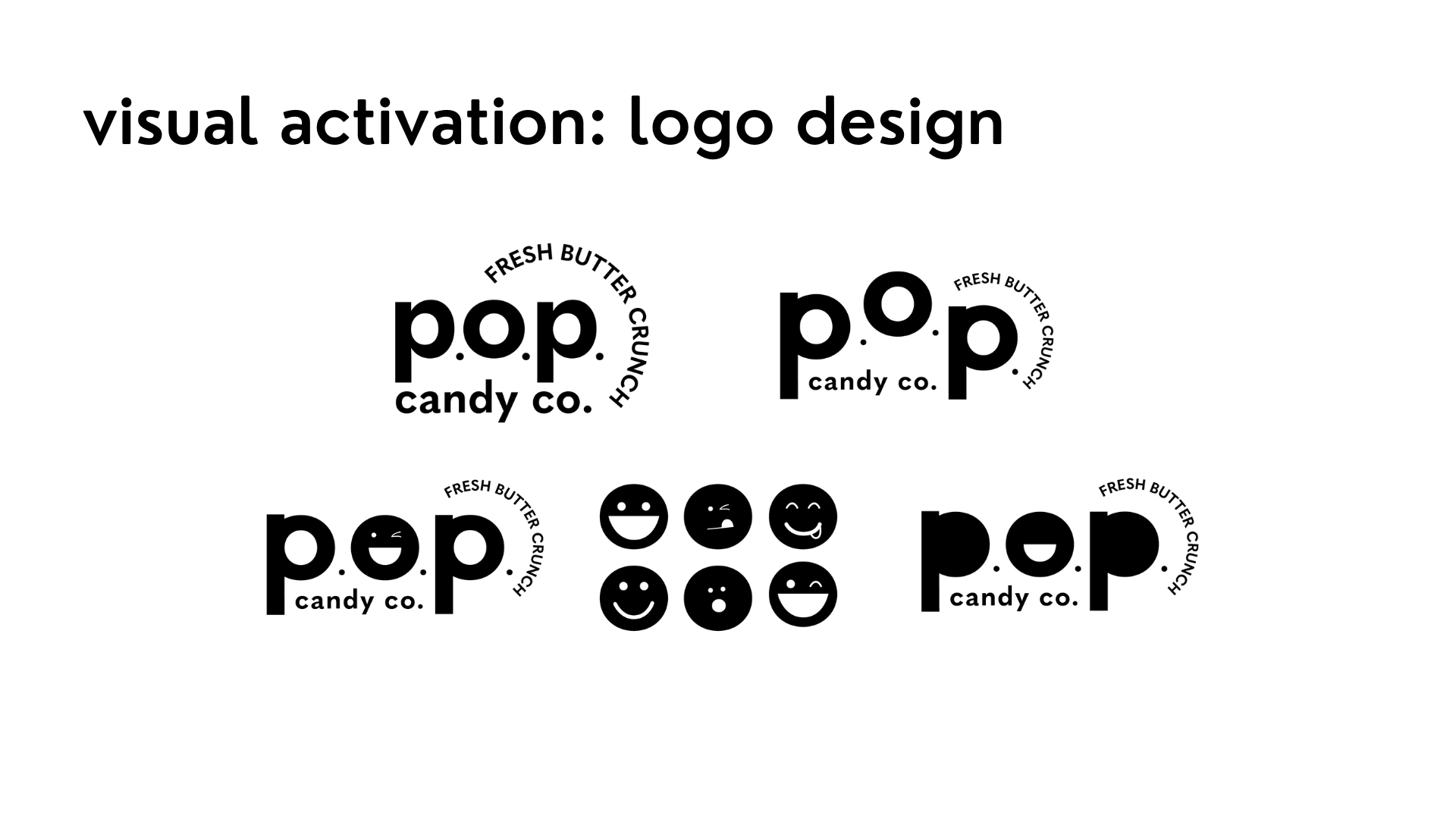
Our team felt like the existing logo design didn't reflect a strong brand identity.
I played around with several logo iterations, trying to break out of the closed circle that the logo existed in previously. We wanted it to feel exciting and fun so I played around with offsetting the letters and using emojis to give viewers an emotional response.
Logo Before & After
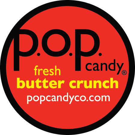
Original Logo
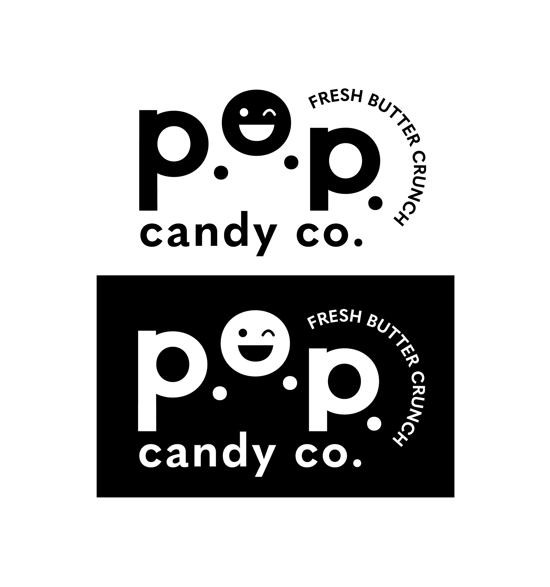
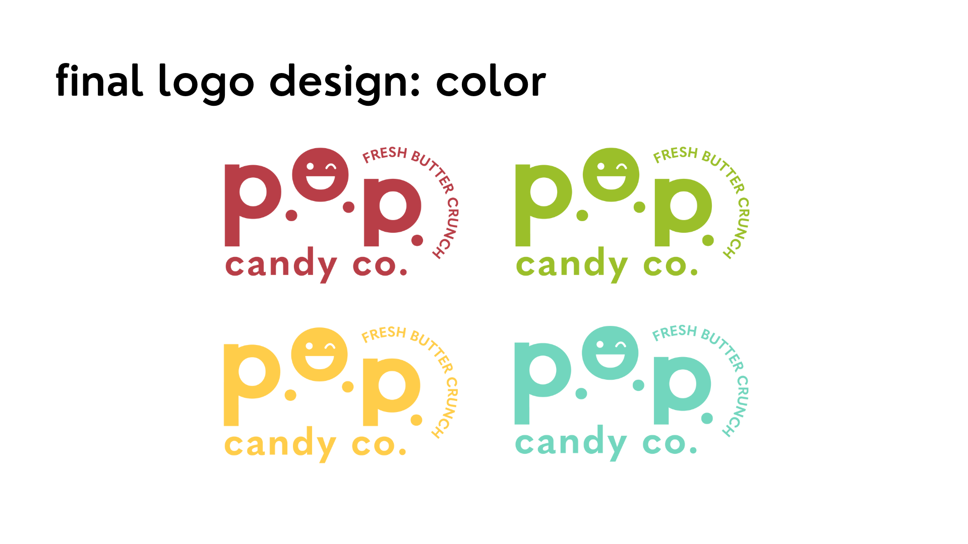
Final Logo
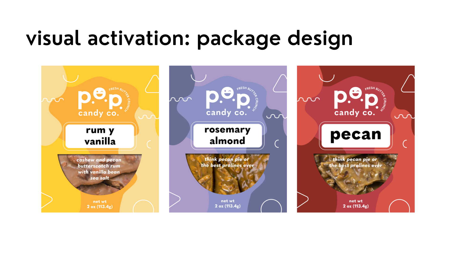
I created package designs and mock-ups of the rum y vanilla, rosemary almond, and pecan flavors, incorporating the new logo.
Package Before & After
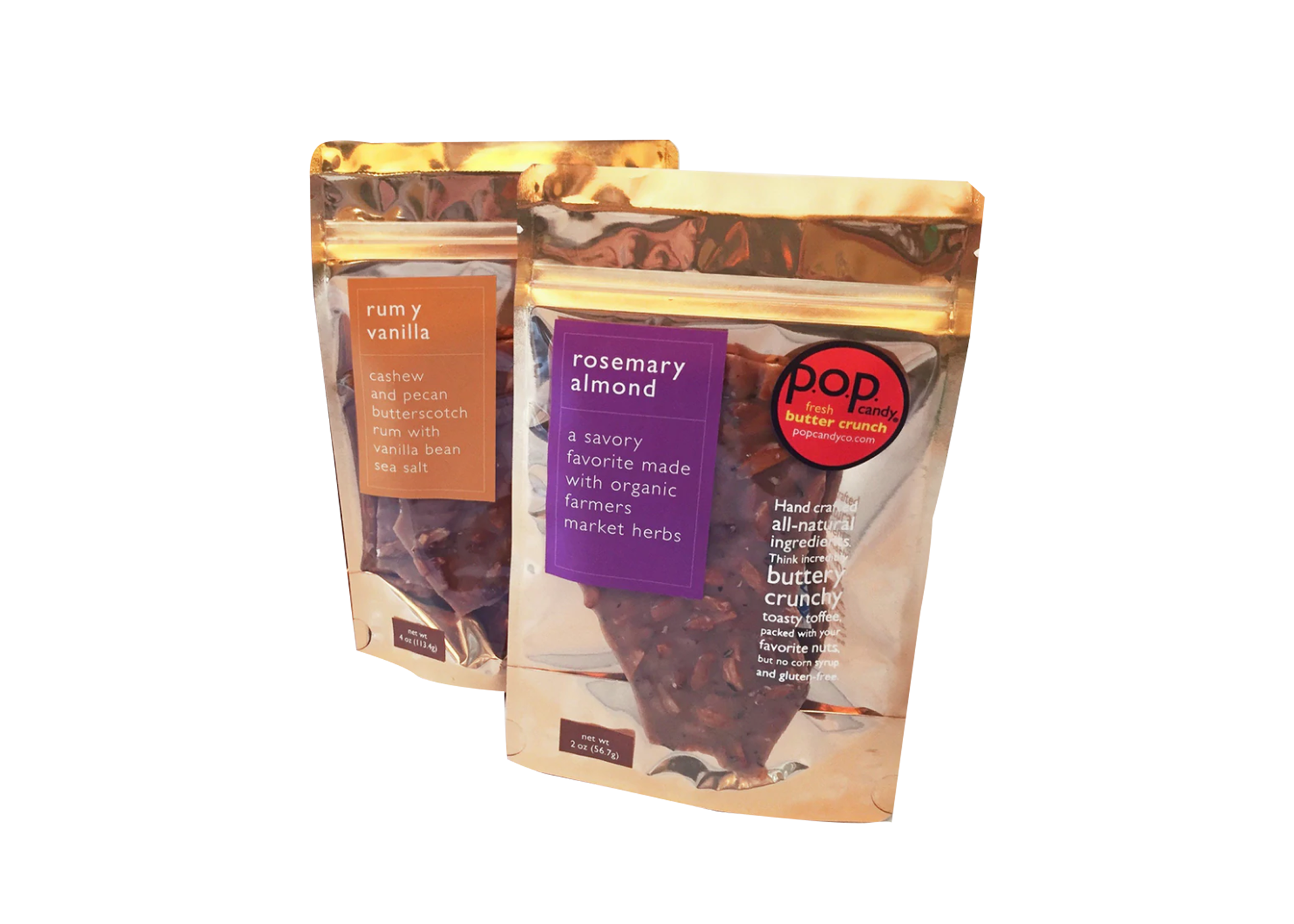
Original Package
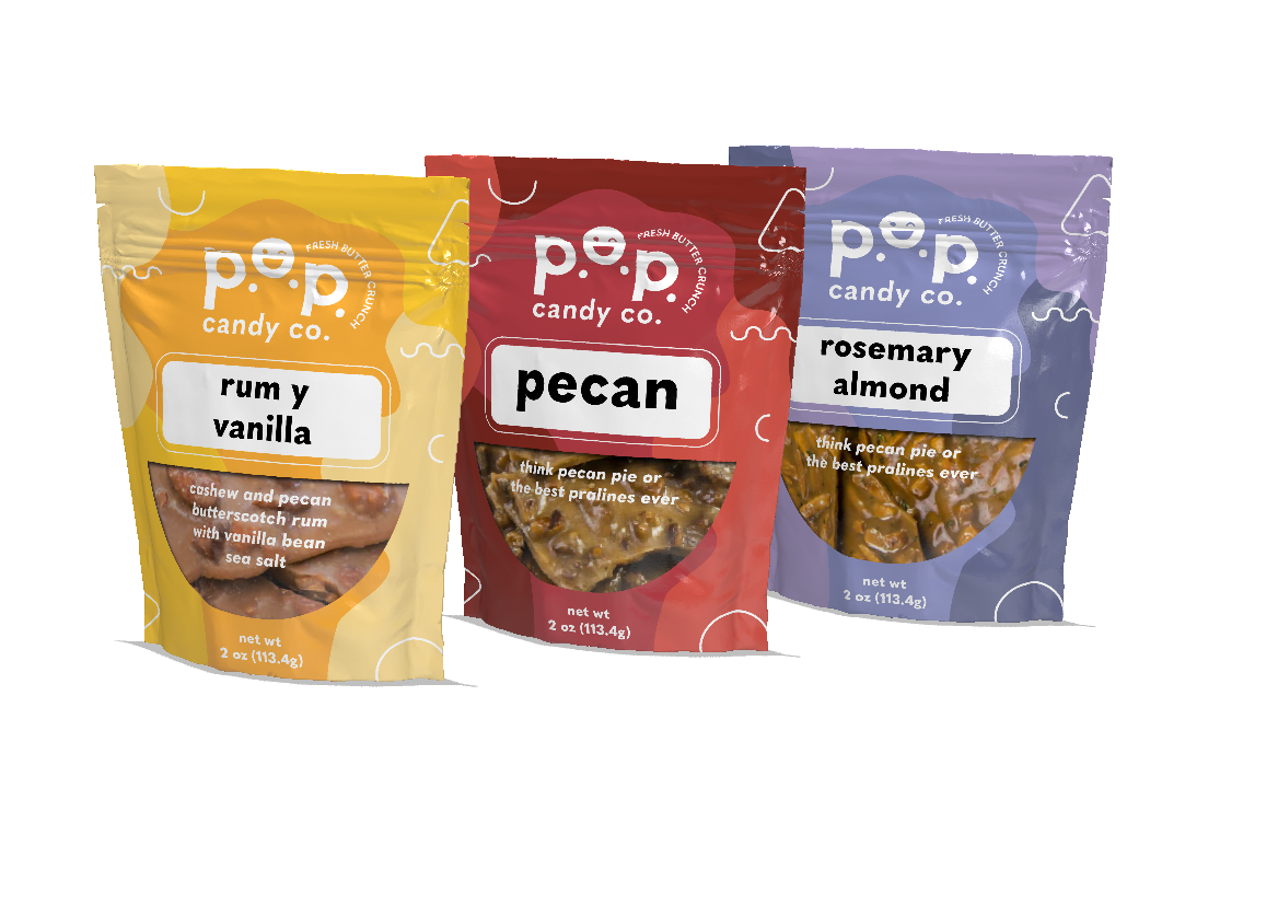
Final Package
Final Thoughts
This was my first experience working with a real client; it was a fulfilling and rewarding process getting to know the faces behind the brand and to receive their feedback throughout the whole process. I learned a lot about client relationships and professionalism.
All the work I created was without any real-world guidelines, budgets, and restraints so it was very fun to experiment and go all out in creating new visual designs for the brand. As a designer I enjoyed being able strengthen p.o.p.'s story visually and rewrite their brand identity from a creative and fresh perspective.
I was able to gain more experience using Adobe Illustrator, Photoshop, and Dimension.