
About
In visual design course, students were assigned to re-design an already existing bottle package found at any local grocery store.
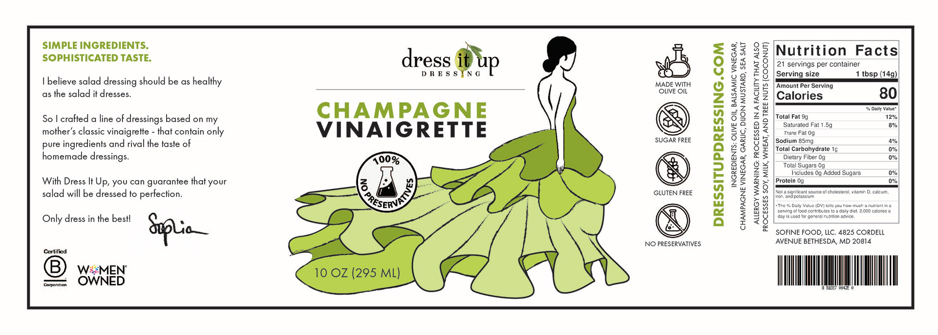
After a trip to Whole Foods, I redesigned the label for dress it up's Champagne Vinaigrette. I used Adobe Illustrator, Photoshop, and Dimension.
Process
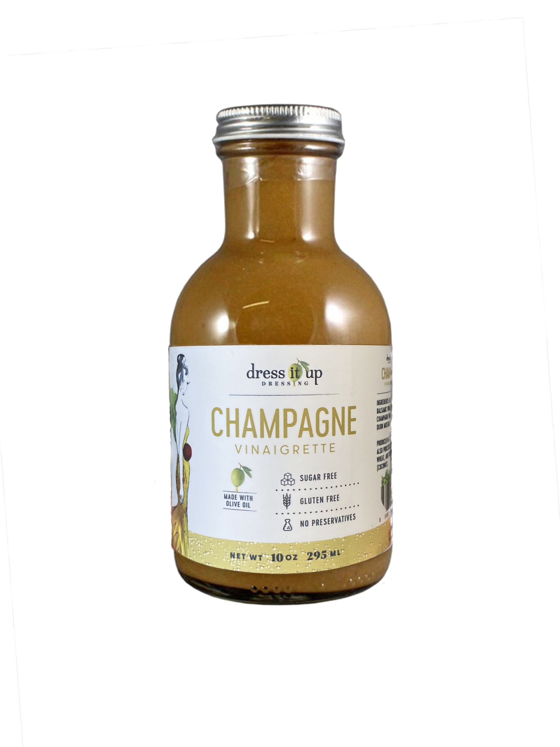
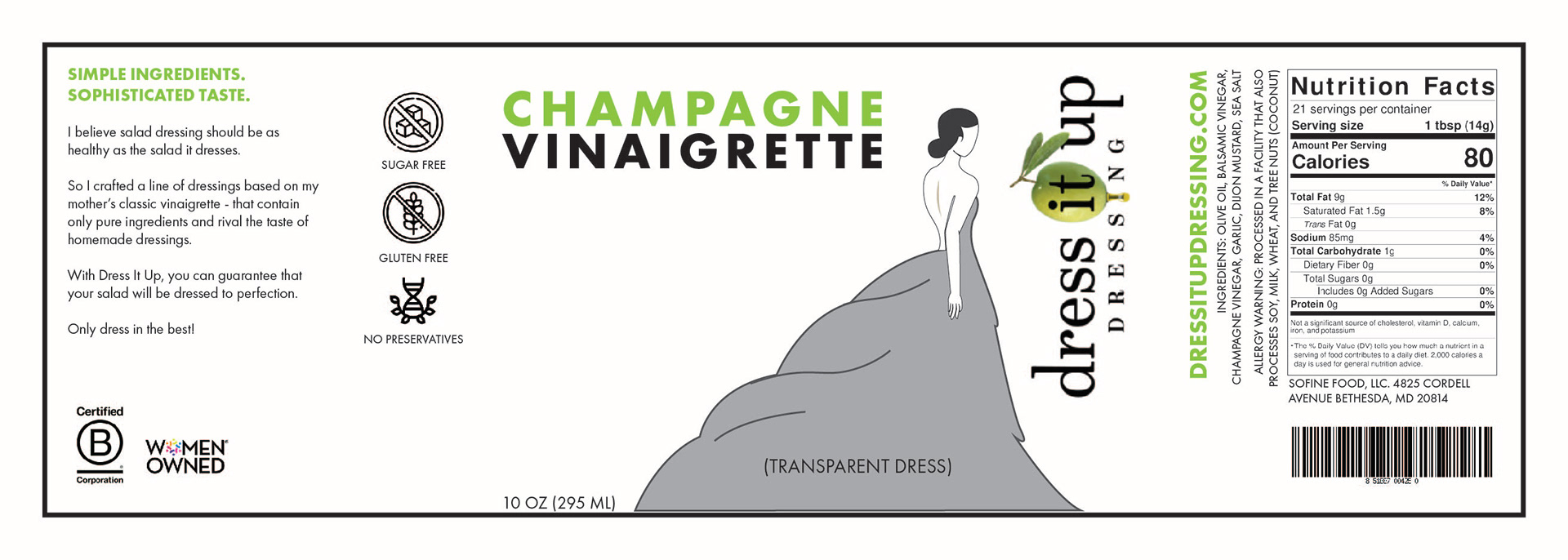
Original Packaging
I found problems with visual hierarchy, among the textual elements especially. For example, the word “CHAMPAGNE” draws the eye over everything else.
The illustration is underwhelming and hard to see from the shelf.
There is a lot of white space and information that doesn’t have to be placed right in the front of the bottle.
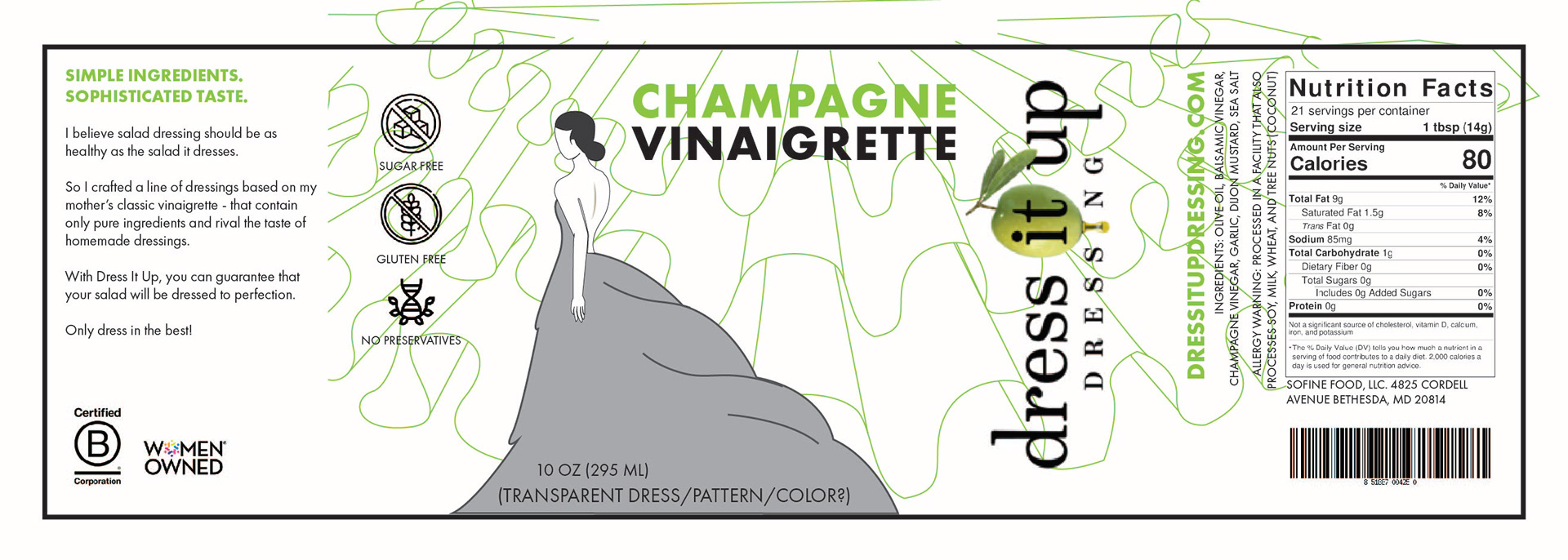
Sketches
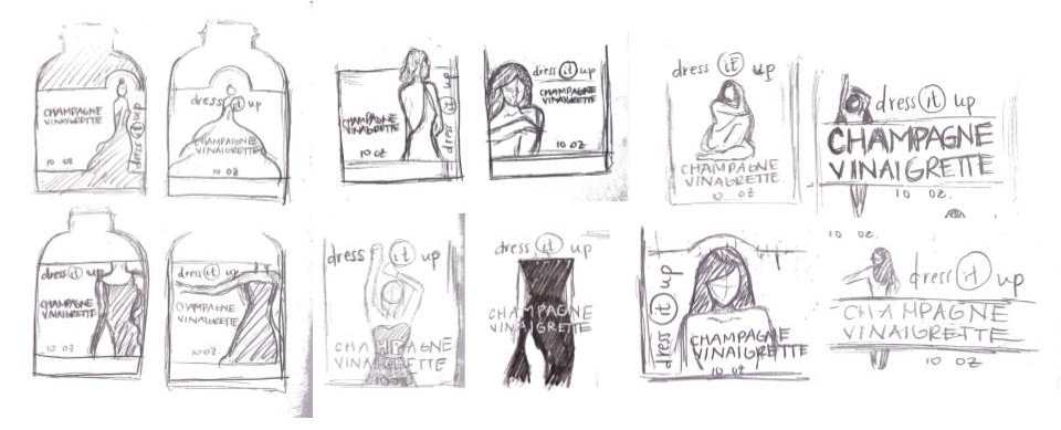

Selected Sketch + Solutions
I wanted to create visual hierarchy between logo, product description, and other information on the bottle.
Highlight the illustrative design on the packaging as the focal point to attract potential buyers from the shelf.
Create pleasing composition and layout throughout the label.
Digital Iterations

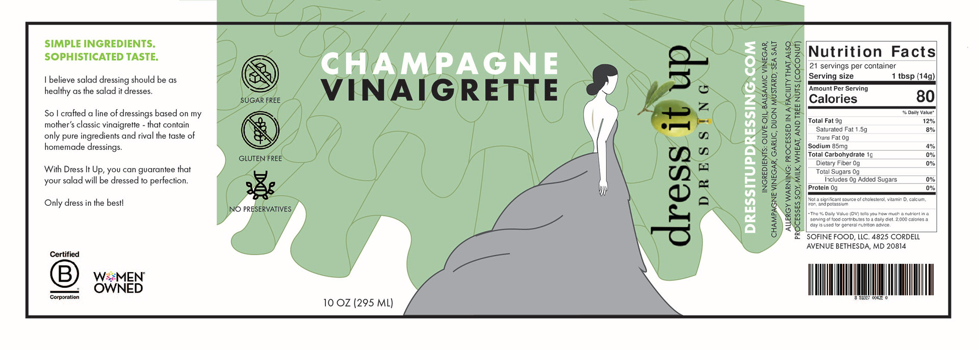
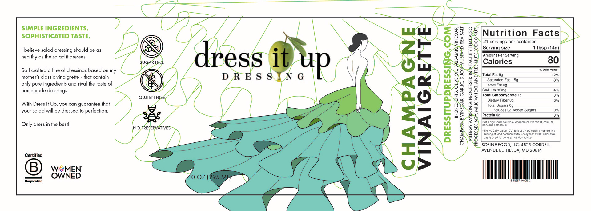
Selected Digital Iteration
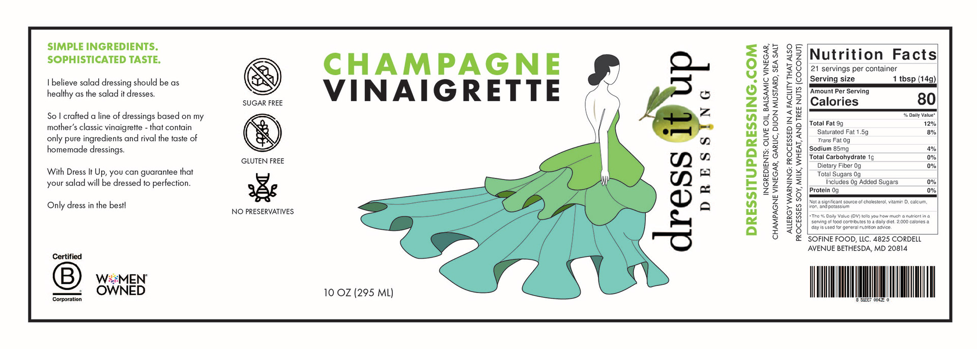
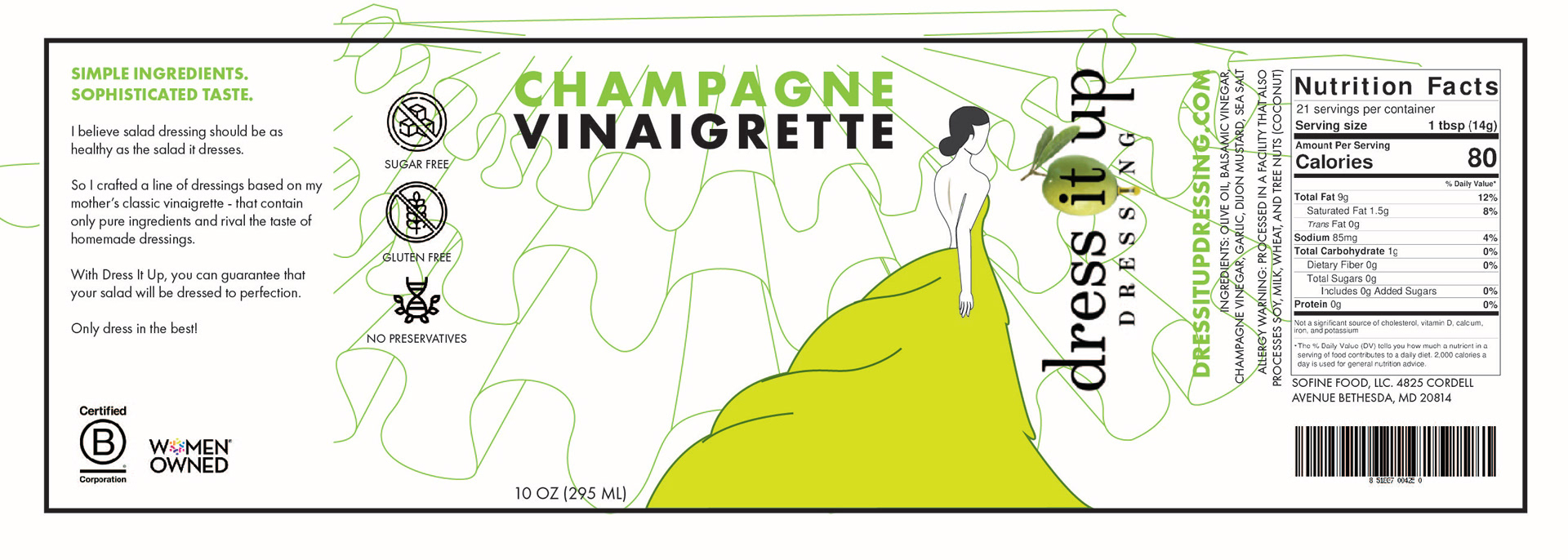
Final Label
Label Before & After
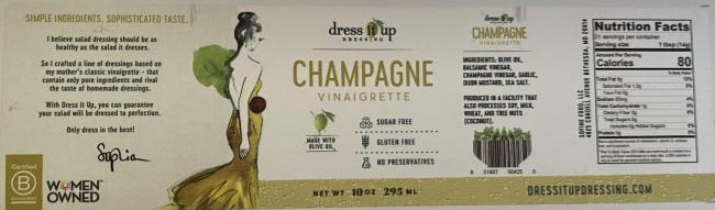
Original Label

Final Label
Mock-Up Before & After

Original Mock-Up
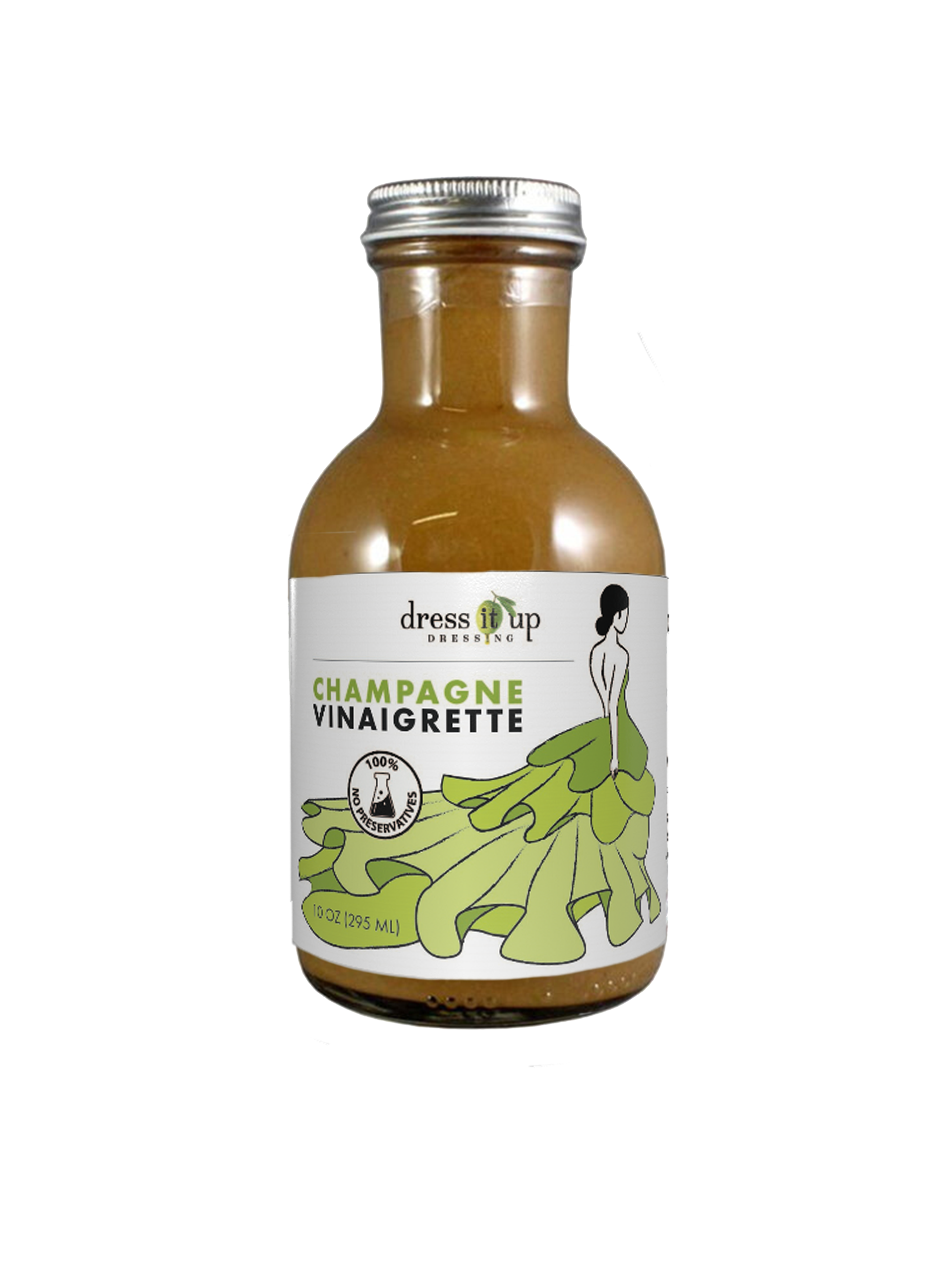
Final Mock-Up
Final Thoughts
Designing something that would go on a tangible product was a new experience for me. I learned about package design--what components are necessary in a package design and what makes package design successful.
I gained experience in Adobe Illustrator and enjoyed creating a compelling design that worked around a central image.